In Part One of this series I illustrated a simple method to identify, quantify and evaluate risk in tasks and projects. If you missed it, you can read it HERE.
Part Two illustrated how to use the information from Part One to create a “Risk Assessment Dashboard”, complete with a custom table, lookup tables, formulae and graphical indicators. You can read it HERE.
This blog entry will show how to use the new “Risk Assessment Dashboard” in data grouping. When the custom fields were created in Part Two, Project was ready to group them. Once grouped, tables could be employed to view specific types of information such as how much work or cost is anticipated for each level of risk. See the figure below for details. Click on any figure in this post to enlarge the figure.
Grouping a field is built into the AutoFiltering feature in Project. Select the “Risk Assessment Table”, then check that field grouping is available by first examining the “Risk Severity” field’s column heading. If you see a list icon to the right of the field description, you can begin grouping immediately. The figure below illustrates where the list icon is in the column heading.
If it’s enabled, click on it and you’ll be rewarded with a list of options including “Group on this field”.
When selected, the grouping is presented. Note that data in each group is being summarized via data rollup in the figure below. At this point choose the table that meets your need, such as “Cost” or “Work”. The first figure in this post is displaying the Cost table.
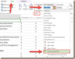
If AutoFiltering is turned off and the list icon is not visible, turn it on! Choose the “View” tab and click on the “Filter:” list icon to get the list of filters and filtering options. Click on the “Display AutoFilter” option.
When it is time to remove the group, ensure you are back in the “Risk Assessment Table”, then click on the group’s field heading and choose “No Group”. You’ll be returned to the ungrouped table.
In Part Four of this series I will use the fields, the formulae, graphical indicators and grouping from this blog entry to report on risk. I will illustrate how to use a defined custom data group to summarize the cost, work and schedule that is developed in the project so far by their respective risk severity. Then we’ll graph it!
Did you enjoy this blog post? If so, please let me know! I love to hear from my readers.


