This posting will make the most sense if the previous three posts are read in order beforehand:
Part One is HERE;
Part Two is HERE;
Part Three is HERE.
In this final post of the series I will create a custom group for use in reporting and graphing purposes. The report will look similar to the figure below at the end of this blog. Click on any figure in this post to enlarge it.
The first step is to create the custom group so it can be used in reporting, charting and graphing:
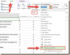
1. Click on the “View” tab then click on the “Group By:” list in the “Data” command group.
2. Click on “New Group By…” in the list.
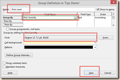
3. In the “Group Definition” dialog, enter the data as itemized in the figure below, then click on “Save”.
4. Test the new group by choosing it from the “Group By:” list. Notice the location of the group in the figure below.
5. After successfully applying the”Risk Level” group, clear the group by choosing “[No Group]” from the “Group By:” list.
The second step is to create the “Risk Analysis” report and graph:
6. Click on the “Report tab, then “New Report”.
7. From the choices offered choose “Comparison”. This will enable you to have multiple charts that graph work against cost and grouped by risk level. See the figure below for detail.
8. The “Report Name“ dialog will appear asking you to name the new report. I chose “Risk Analysis” for consistency. After the name is entered, click on the “OK” button.
9. Project creates the “Risk Analysis” report and places you in the “Design” tab. Note this is initially a blank slate. We will have to insert the charts for work and cost, then format them. It should look like the figure below.
10. Click on the “Chart” button located in the “Insert” command group. The “Insert Chart” dialog will appear. Since we will be using multiple fields and data sets, we will need a “Clustered Column” type of chart. Just click on the “OK” button to create it. The figure below points out the locations and selections for this new chart.
11. The basic chart is created and ready for formatting. Note that Project has placed you in “Chart Tools” for that purpose. Also note the fields compared in the chart. The fields are made visible or not by checking the “Select Field” in the “Field List” on the side of the screen. See figure below for location of these details.
12. Add the “Risk Level” Group to the chart. At the bottom of the “Field List” find the “Group By:” list and choose the “Risk Level” group. The chart changes by organizing the amount of work by low, medium or high risk. See the diagram below for details.
13. Give the chart a Data Table. From the “Design” tab, click on “Add Chart Element”. Click on “Data Table” and click on “No Legend Keys”. You should get a chart formatted close to that of the figure below.
14. The chart would be clearer with a title. Click on “Add Chart Element” again and click on “Chart Title” and “Above Chart”.
15. When you click on your new chart, it now has the name “Chart Title”. Click in the title and change it to something descriptive like “Work Totals by Risk Level”.
16. You can now format the chart to whatever chart type you find works for you by clicking on the chart and choosing “Change Chart Type” from the “Design” tab in “Chart Tools”. The charts at the beginning of this blog entry were “3-D Column” if you wish to replicate that format.
17. If you wish to add a “Cost Totals by Risk Level” chart, follow exactly the same steps as steps 10 – 16, only use “Actual Cost”, Remaining Cost” and “Cost” fields from the “Field List”. You will need to modify the new chart’s title and possibly position the charts by clicking and dragging them where you want them.
Now that you’ve tried creating custom reports, experiment with them! Powerful options are a click away. Try inserting a table to the report you just made. Try inserting a picture. These reporting elements and more are waiting for your discovery in the “Design” tab and in the “Insert” command group.
Projects can be risky business. In this four part series you have learned a very basic technique to identify, assess and convey the state of risks in your project. You have created custom fields in custom tables. You created a formula that drives graphical indicators, learned in-field and custom grouping and created a custom report that makes visible the work and costs of a project in terms of risk levels.
Your next challenge is to manage project risk relentlessly by continually re-evaluating risk, keeping risk data current, and making data informed decisions to keep moving forward.
Did you enjoy this series? I sincerely hope that they were helpful. If so, please send me an email. I love to hear from my readers!


